Your website might look great, but if it's not optimized for conversions, you're losing money every single day. Studies show that 96% of visitors leave without converting, and many of these losses are due to easily fixable UX issues. Here are five critical UX fixes that can boost your conversion rate immediately—with real data and actionable steps.
The Cost of Poor UX
Before diving into solutions, let's understand the problem. A website with a 2% conversion rate that gets 10,000 monthly visitors generates 200 conversions. If you improve that to just 3% (a 50% increase), you get 300 conversions—that's 100 more sales per month. For a business with a $100 average order value, that's $10,000 in additional monthly revenue, or $120,000 annually.
Now imagine if your conversion rate is even lower due to UX issues. The potential loss is staggering. Every second of delay, every confusing element, and every unnecessary step costs you real money.
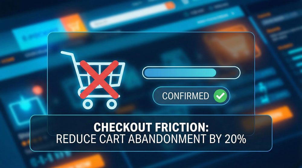
1. Simplify Your Checkout Process
Every extra field in your checkout form reduces conversions by 2-5%. If you have 10 unnecessary fields, you could be losing 20-50% of potential sales. The solution? Only ask for essential information.
Amazon revolutionized e-commerce by introducing one-click checkout. While you might not need that level of simplicity, you can significantly reduce friction. Here's what to do:
- Remove optional fields during checkout: If you need additional information, ask for it after the purchase is complete.
- Use autofill for address and payment info: Modern browsers can autofill most information. Make sure your forms support this.
- Offer guest checkout option: Forcing account creation can reduce conversions by up to 45%. Let customers checkout as guests, then offer account creation after purchase.
- Show progress indicators: Let users know how many steps remain. This reduces anxiety and abandonment.
- Save cart information: If a user abandons, save their cart and email them a link to complete the purchase.
Real Example: An e-commerce client reduced their checkout form from 12 fields to 5 essential fields. Their conversion rate increased by 28% within the first month.
2. Fix Mobile Navigation
53% of website traffic comes from mobile devices, yet many sites still have poor mobile navigation. Hidden menus, tiny buttons, and confusing layouts drive users away. Mobile users have shorter attention spans and less patience for poor experiences.
Here's how to fix mobile navigation:
- Use a hamburger menu that's easy to tap: Minimum 44x44px touch target (Apple and Google recommend this). Many sites use 30px buttons that are frustrating to tap.
- Keep navigation items visible and accessible: Don't hide important links behind multiple taps. Use a sticky header with key navigation items.
- Test on actual mobile devices: Don't just test in responsive view. Use real phones to experience what your users experience.
- Ensure all CTAs are thumb-friendly: Place important buttons where thumbs naturally rest (bottom third of screen for mobile).
- Use bottom navigation for key actions: For mobile apps or key site actions, bottom navigation is more accessible than top navigation.
Impact: One client improved their mobile conversion rate by 35% simply by fixing navigation and making buttons larger and more accessible.
3. Add Social Proof
People trust other people more than they trust your marketing copy. Without social proof, you're asking visitors to take a leap of faith. Research shows that 92% of consumers trust recommendations from others (even strangers) over brand messaging.
Here's how to leverage social proof effectively:
- Display customer reviews and testimonials prominently: Place them above the fold, not buried at the bottom. Include photos and names for authenticity.
- Show real-time purchase notifications: "Sarah from New York just purchased this" creates urgency and trust. Tools like Proof or Fomo can help.
- Include trust badges and security seals: SSL certificates, payment security badges, money-back guarantees, and industry certifications build trust.
- Add customer count or "Join X satisfied customers": Numbers create social proof. "Join 10,000+ satisfied customers" is more powerful than just "Buy Now."
- Showcase case studies and results: Real results from real customers are more powerful than generic testimonials.
- Display ratings and review counts: If you have 4.8 stars with 500+ reviews, show it prominently.
Data Point: Adding social proof elements can increase conversions by 15-35%, depending on your industry and current setup.
4. Optimize Page Load Speed
A 1-second delay in page load time can reduce conversions by 7%. If your site takes 5 seconds to load, you've already lost 35% of potential customers. Google research shows that 53% of mobile users abandon sites that take longer than 3 seconds to load.
Speed optimization isn't just about user experience—it's also an SEO ranking factor. Here's your speed optimization checklist:
- Compress images: Use WebP format, compress JPEGs/PNGs, and serve appropriately sized images for different devices. A 5MB hero image is killing your load time.
- Minify CSS and JavaScript: Remove whitespace, comments, and unnecessary code. Use tools like UglifyJS or CSSNano.
- Enable browser caching: Set proper cache headers so returning visitors don't re-download everything.
- Use a CDN for faster content delivery: Serve static assets from servers closer to your users. Cloudflare, AWS CloudFront, or similar services can reduce load times by 30-50%.
- Lazy load images and content: Don't load everything at once. Load images as users scroll.
- Optimize hosting: Cheap shared hosting can't handle traffic spikes. Invest in quality hosting or use a platform like Vercel, Netlify, or WP Engine.
- Aim for under 3 seconds load time: This is the benchmark. Under 2 seconds is excellent, under 1 second is exceptional.
Real Results: A client reduced their load time from 6.2 seconds to 2.1 seconds. Their bounce rate dropped by 42%, and conversions increased by 18%.
5. Make Your Value Proposition Crystal Clear
If visitors can't understand what you do and why they should care within 3 seconds, they'll leave. Your value proposition should be the first thing they see. This is your chance to make a first impression—make it count.
Here's how to craft and display a compelling value proposition:
- Use clear, benefit-focused headlines: Instead of "We provide solutions," say "We help e-commerce stores increase revenue by 40%." Be specific and outcome-focused.
- Explain what makes you different: Why should they choose you over competitors? What's your unique advantage?
- Show the outcome, not just features: "Fast website" is a feature. "Get more customers with a website that loads in 1 second" is an outcome.
- Use visual hierarchy to guide attention: Make your value proposition the largest, most prominent element on the page. Use contrast, size, and positioning to draw the eye.
- Support with proof: Back up your claims with numbers, testimonials, or case studies.
- Test different variations: A/B test different value propositions to see what resonates with your audience.
Example Transformation: A SaaS company changed their headline from "Enterprise Software Solutions" to "Reduce Customer Support Costs by 40% with AI Automation." Their conversion rate increased by 52%.
Implementation Strategy
Don't try to fix everything at once. Here's a recommended approach:
- Week 1: Fix page load speed (biggest impact, relatively easy)
- Week 2: Simplify checkout process
- Week 3: Add social proof elements
- Week 4: Optimize mobile navigation
- Week 5: Refine value proposition based on data
Measure everything. Use tools like Google Analytics, Hotjar, or Microsoft Clarity to track user behavior and identify where users are dropping off.
Start Fixing Today
These five fixes don't require a complete redesign. You can implement most of them within a week and start seeing results immediately. The key is to test, measure, and iterate based on real user behavior data.
Remember: Every second counts, every field matters, and every user experience detail can make or break a conversion. Don't let your website leak money any longer. Start with one fix today, measure the impact, and continue optimizing.
The businesses that win online aren't necessarily the ones with the biggest budgets—they're the ones that pay attention to user experience and continuously optimize based on data. Your website should be a revenue engine, not a money leak.